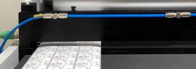
Let’s face it, UL standards and documents aren’t exactly easy reading material. More often than not they seem to add confusion than produce clarity. One such subject where we see this is a lot has to do with what I like to call the “S” designations. Customers bump up against references to S24 this or S48 that, and are left wondering what exactly they are supposed to do. A common misnomer is that the S-designations refers to the actual label dimensions, which just isn’t the case.
S designations, such as s24, set limits on the size of the typeface of various information and warnings. Basically, UL is trying to prevent safety text from being so small that it is unreadable. Depending on the warning or message the font must be a specific size. When it comes to the actual physical label dimensions, the UL labels just have to be able to accommodate the required text at the correct font size.
What’s nice about this is that you actually have some wiggle room to lay out the label in a way that makes sense for your product. It can be taller or wider and it doesn’t matter as long as the message is displayed at the correct size. Below is an example of what an “S” designation table looks like–this one is taken from UL standard 1598 (Luminaires).
Format minimum size designation for marking height and typeface
| Size designation | Letter height | Font size | Font typeface | |
| mm | (in) | (points) | ||
| S16 | 1.6 | (0.062) | 6 | Not specified |
| S24 | 2.4 | (0.094) | 10 | Univers bold/Arial bold/Helvetica bold/Zurich BT Bold |
| S32 | 3.2 | (0.125) | 12 | Not specified |
| S48 | 4.8 | (0.188) | 19 | Univers bold/Arial bold/Helvetica bold/Zurich BT Bold |